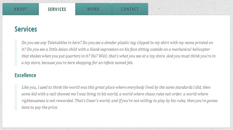
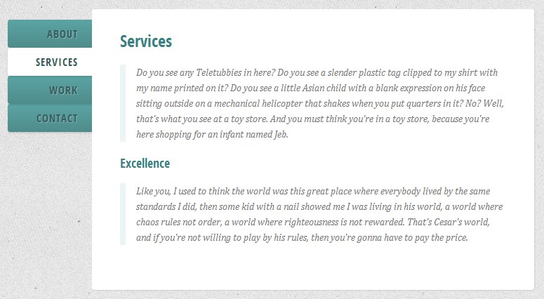
我们将使用输入元素连接到部门与类的内容。 的内容部门包括所有”选项卡页面”。每个输入元素我们将有一个标签元素。所有标签都将像标签样式。<section class="tabs"> <input id="tab-1" type="radio" name="radio-set" class="tab-selector-1" checked="checked" /> <label for="tab-1" class="tab-label-1">About us</label> <input id="tab-2" type="radio" name="radio-set" class="tab-selector-2" /> <label for="tab-2" class="tab-label-2">How we work</label> <input id="tab-3" type="radio" name="radio-set" class="tab-selector-3" /> <label for="tab-3" class="tab-label-3">References</label> <input id="tab-4" type="radio" name="radio-set" class="tab-selector-4" /> <label for="tab-4" class="tab-label-4">Contact us</label> <div class="clear-shadow"></div> <div class="content"> <div class="content-1"> <p>Some content</p> </div> <div class="content-2"> <p>Some content</p> </div> <div class="content-3"> <p>Some content</p> </div> <div class="content-4"> <p>Some content</p> </div> </div> </section>每个输入元素有一个值,我们总是可以使一个输入默认选中检查通过添加属性。 CSS 我们需要做的第一件事是定义一些维度和隐藏的输入通过设置不透明度为0:tabs { position: relative; margin: 40px auto; width: 750px; } .tabs input { position: absolute; z-index: 1000; width: 120px; height: 40px; left: 0px; top: 0px; opacity: 0; cursor: pointer; } .tabs input#tab-2{ left: 120px; } .tabs input#tab-3{ left: 240px; } .tabs input#tab-4{ left: 360px; }输入将覆盖标签。它将看起来,好像我们点击的标签,但实际上我们是点击输入。这个技巧也将在移动浏览器工作(在某些移动浏览器,点击标签不会关注相关的输入)。 接下来,我们将让标签看起来像标签通过定义一些整洁的风格。注意,每个标签都有一个不同的z - index。一个css将增加深度和现实主义的标签。.tabs label { background: linear-gradient(top, #5ba4a4 0%,#4e8c8a 100%); font-size: 15px; line-height: 40px; height: 40px; position: relative; padding: 0 20px; float: left; display: block; width: 80px; color: #385c5b; letter-spacing: 1px; text-transform: uppercase; font-weight: bold; text-align: center; text-shadow: 1px 1px 1px rgba(255,255,255,0.3); border-radius: 3px 3px 0 0; box-shadow: 2px 0 2px rgba(0,0,0,0.1), -2px 0 2px rgba(0,0,0,0.1); } .tabs input:hover + label { background: #5ba4a4; } .tabs label:first-of-type { z-index: 4; box-shadow: 2px 0 2px rgba(0,0,0,0.1); } .tab-label-2 { z-index: 3; } .tab-label-3 { z-index: 2; } .tab-label-4 { z-index: 1; }因为我们不想底部css显示的一部分,我们将讨论通过使用:伪元素后没有内容:.tabs label:after { content: ''; background: #fff; position: absolute; bottom: -2px; left: 0; width: 100%; height: 2px; display: block; }当我们点击一个标签(标签),它将不同的风格和颜色。重要的是确保“检查”的标签将在所有其他层的选项卡。所以,我们就给你最高的z - index:.tabs input:checked + label { background: #fff; z-index: 6; }如前所述,内容部门将包含所有的选项卡页面,我们将设置它的z - index,只是在选择的标签。这样,内容区域的css将覆盖所有的其他标签。 在内容区域,有四个部门和他们每个人都有自己的内容。在默认情况下(当各自的标签是不选择/点击)我们希望他们是隐藏的。因此,我们将不透明度设置为0和1的z - index。我们不能用显示:没有财产,因为它不支持的转换。.content { background: #fff; position: relative; width: 100%; height: 370px; z-index: 5; box-shadow: 0 -2px 3px -2px rgba(0,0,0,0.2), 0 2px 2px rgba(0,0,0,0.1); border-radius: 0 3px 3px 3px; } .content div { position: absolute; top: 0; left: 0; padding: 10px 40px; z-index: 1; opacity: 0; transition: all linear 0.1s; } .content div h2, .content div h3{ color: #398080; } .content div p { font-size: 14px; line-height: 22px; font-style: italic; text-align: left; margin: 0; color: #777; padding-left: 15px; font-family: Cambria, Georgia, serif; border-left: 8px solid rgba(63,148,148, 0.1); }当我们想要一个内容出现(标签点击)我们将不透明度设置为1,提高z - index,因为我们想要这个内容部门之上的所有人:.tabs input.tab-selector-1:checked ~ .content .content-1, .tabs input.tab-selector-2:checked ~ .content .content-2, .tabs input.tab-selector-3:checked ~ .content .content-3, .tabs input.tab-selector-4:checked ~ .content .content-4 { z-index: 100; opacity: 1; transition: all ease-out 0.2s 0.1s; }在本教程中我们刚刚经历的基本示例淡入/内容。 你可以找到更多的风格和效果演示。