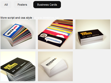
HTML:<div class="selecter"> <div class="selecterBtns"> <ul class="nolist"> <li><a href="#" rel="all" class="active">All</a></li> <li><a href="#" rel="poster">Web</a></li> <li><a href="#" rel="card">Print</a></li> </ul> </div> <div class="selecterContent"> <ul class="nolist"> <li class="poster"> .. </li> <li class="card"> .. </li> <!-- next items --> </ul> </div> </div>CSS:.selecterContent { width:960px; min-height:; /* you need to specify minimum height value */ float:left; clear:both; } .selecterContent li { width:140px; /* you need to specify width and height values of the element */ height:120px; overflow:hidden; } ul.nolist, ul.nolist li { display:block; list-style:none; padding:0; margin:0; } ul.nolist li { float:left; }JS:$('.selecter').mobilyselect({ collection: 'all', // shows specified collection on startup animation: 'absolute', // type of animation, available options: plain, fade, absolute duration: 500, // duration of animation listClass: 'selecterContent', // main container btnsClass: 'selecterBtns', btnActiveClass: 'active', // add class name to the button elements: 'li', onChange: function(){}, // call the function when collection changes onComplete: function(){} // call the function when animation is completed });