一款功能非常强大的jQuery消息通知框和信息提示框插件。这个插件分为两个部分:消息通知框和信息提示框。它能非常好的结合Bootstrap使用。
使用方法
使用时要引入jQuery和lobibox.min.js以及lobibox.min.css文件。
<script src="js/jquery-1.11.2.min.js"></script>
<link rel="stylesheet" href="dist/css/LobiBox.min.css">
<script src="dist/js/lobibox.min.js"></script>
创建信息提示框
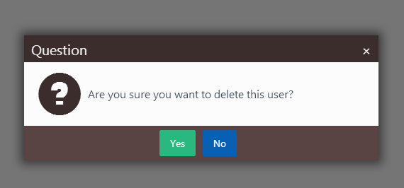
// Confirm
Lobibox.confirm({
... //Options
});
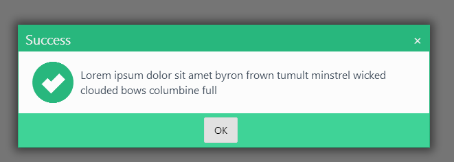
// Alert
Lobibox.alert(
'error|success|warning|info', // Any of the following
{
... //Options
}
);
// Prompt
Lobibox.prompt(
'', // Any HTML5 input type is valid
{
//Options
}
);
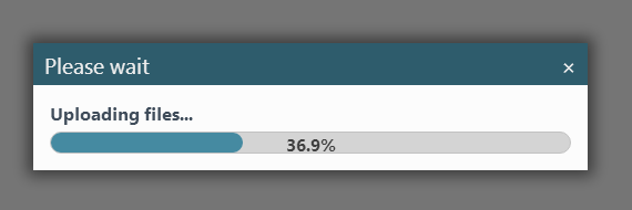
// Progress
Lobibox.progress({
//Options
});
// Window
Lobibox.window({
//Options
});
信息提示框的默认参数
horizontalOffset: 5,
width : 600,
// Height is automatically given calculated by width
height : 'auto',
// Show close button or not
closeButton : true,
// Make messagebox draggable
draggable : false,
// Class for custom buttons
customBtnClass : 'lobibox-btn-default',
modal : true,
debug : false,
// Position where buttons should be aligned
buttonsAlign : 'center',
// Close messagebox on Esc press
closeOnEsc : true,
//Overriding default options
Lobibox.base.DEFAULTS = $.extend({}, Lobibox.base.DEFAULTS, {
//override any options from default options
});
信息提示框的可用参数
Lobibox.base.OPTIONS = {
// DO NOT change this value.
// Some functionality is depended on it
bodyClass : 'lobibox-open',
// DO NOT change this object.
// Some functionality is depended on it
modalClasses : {
'error' : 'lobibox-error',
'success' : 'lobibox-success',
'info' : 'lobibox-info',
'warning' : 'lobibox-warning',
'confirm' : 'lobibox-confirm',
'progress' : 'lobibox-progress',
'prompt' : 'lobibox-prompt',
'default' : 'lobibox-default',
'window' : 'lobibox-window'
},
// This is option how buttons can be shown.
// What are buttonsAlign option available values
buttonsAlign: ['left', 'center', 'right'],
// You can change the title or class of buttons from here or use the same structure object for button when creating messagebox
// closeOnClick : true will close the messagebox when clicking this type of button.
// Set it to false not to close messagebox when clicking on it
buttons: {
ok: {
'class': 'lobibox-btn lobibox-btn-default',
text: 'OK',
closeOnClick: true
},
cancel: {
'class': 'lobibox-btn lobibox-btn-cancel',
text: 'Cancel',
closeOnClick: true
},
yes: {
'class': 'lobibox-btn lobibox-btn-yes',
text: 'Yes',
closeOnClick: true
},
no: {
'class': 'lobibox-btn lobibox-btn-no',
text: 'No',
closeOnClick: true
}
}
};
//Overriding default options
Lobibox.base.OPTIONS = $.extend({}, Lobibox.base.OPTIONS, {
... //override any options except those above which is written "DO NOT change"
});
创建消息通知框
Lobibox.notify(
// 'warning', 'info', 'success', 'error'
'warning',
{
...
}
);
消息通知框的默认参数
title: true,
// normal, mini, large
size: 'normal',
// Show animation class. (Uses animate.css)
showClass: 'flipInX',
// Hide animation class (Uses animate.css)
hideClass: 'zoomOutDown',
// Icon of notification.
// Leave as is for default icon or set custom string
icon: true,
// Message of notification
msg: '',
// Image source string
img: null,
// Make notifications closable
closable: true,
// Hide notification after this time (in miliseconds)
delay: 5000,
// Show timer indicator
delayIndicator: true,
// Close notifications by clicking on them
closeOnClick: true,
// Width of notification box
width: 400,
// Sound of notification. Set this false to disable sound.
// Leave as is for default sound or set custom soud path
sound: true,
// Place to show notification.
// Available options: "top left", "top right", "bottom left", "bottom right"
position: "bottom right"
// Overriding default options
Lobibox.notify.DEFAULTS = $.extend({}, Lobibox.notify.DEFAULTS, {
... //override any options from default options
});