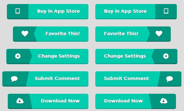
我从网站上看到一些漂亮的按钮但这些都是通过图像实现的。我想重新创建,仅用CSS样式。使用css边境技巧使三角箭头和框阴影创建3 d效果,我只创建了一个简单的css按钮看起来一样好。添加转换添加一个小动画,你有一个漂亮的动画按钮。

.btn {
  box-sizing:border-box;
   -moz-box-sizing:border-box;
   -webkit-box-sizing:border-box;

  position: relative;
  display: inline-block;
  overflow: hidden;
  height: 53px;

  border-radius: 6px;
  -moz-border-radius: 6px;
  -webkit-border-radius: 6px;

  line-height: 30px;
  font-size: 16px;
  font-weight: bold;
  text-shadow: 0px 1px 1px #888;
}

  .btn span.icon, .btn span.title {
    display: block;
    position: relative;
    line-height: 50px;
    padding: 0 30px;

    border-radius: 6px;
    -moz-border-radius: 6px;
    -webkit-border-radius: 6px;
  }

    .btn span.left {
      float: left;

      border-radius: 6px 0 0 6px;
      -moz-border-radius: 6px 0 0 6px;
      -webkit-border-radius: 6px 0 0 6px;
    }
    .btn span.right {
      float: right;

      border-radius: 0 6px 6px 0;
      -moz-border-radius: 0 6px 6px 0;
      -webkit-border-radius: 0 6px 6px 0;
    }

  .btn span.icon {
    font-size: 23px;
    background-color: #00967f;

    -webkit-box-shadow: 0 3px 0 0 #007261;
    box-shadow: 0 3px 0 0 #007261;
    text-shadow: 0px 1px 1px #888;
  }
  .btn span.title {
    -webkit-box-shadow: 0 3px 0 0 #00ae94;
    box-shadow: 0 3px 0 0 #00ae94;
    background-color: #00cdae;
  }

  /* arrows */
  .btn span.arrow-left, .btn span.arrow-right {
    position: absolute;
    width: 0;
    height: 0;
    border-top: 25px solid transparent;
    border-bottom: 25px solid transparent;

    -webkit-transition: all .15s;
    -transition: all .15s;
    -webkit-transition-property: left, right;
    transition-property: left, right;

  }

  .btn.left span.arrow-left {
    right: 0;
    -webkit-box-shadow: 10px 0 0 0 #00cdae,
                10px 3px 0 0 #00ae94;
    box-shadow: 10px 0 0 0 #00cdae,
                10px 3px 0 0 #00ae94;
    border-right:10px solid #00cdae;
  }
  .btn.right span.arrow-left {
    right: 0;
    -webkit-box-shadow: 10px 0 0 0 #00967f,
                10px 3px 0 0 #007261;
    box-shadow: 10px 0 0 0 #00967f,
                10px 3px 0 0 #007261;
    border-right:10px solid #00967f;
  }

  .btn.left span.arrow-right {
    left: 0;
    -webkit-box-shadow: -10px 0 0 0 #00967f,
                -10px 3px 0 0 #007261;
    box-shadow: -10px 0 0 0 #00967f,
                -10px 3px 0 0 #007261;
    border-left:10px solid #00967f;
  }
  .btn.right span.arrow-right {
    left: 0;
    -webkit-box-shadow: -10px 0 0 0 #00cdae,
                -10px 3px 0 0 #00ae94;
    box-shadow: -10px 0 0 0 #00cdae,
                -10px 3px 0 0 #00ae94;
    border-left:10px solid #00cdae;
  }

  /* Slants */
  .btn span.slant-left, .btn span.slant-right {
    position: absolute;
    width: 0;
    height: 0;
    border-top: 0 solid transparent;
    border-bottom: 50px solid transparent;

    -webkit-transition: all .15s;
    -transition: all .15s;
    -webkit-transition-property: left, right;
    transition-property: left, right;

  }

  .btn.left span.slant-right {
    left: 0;
    -webkit-box-shadow: -10px 0 0 0 #00967f,
                -10px 3px 0 0 #007261;
    box-shadow: -10px 0 0 0 #00967f,
                -10px 3px 0 0 #007261;
    border-left:10px solid #00967f;
  }
  .btn.right span.slant-right {
    left: 0;
    -webkit-box-shadow: -10px 0 0 0 #00cdae,
                -10px 3px 0 0 #00ae94;
    box-shadow: -10px 0 0 0 #00cdae,
                -10px 3px 0 0 #00ae94;
    border-left: 10px solid #00cdae;
  }
  .btn.left span.slant-left {
    right: 0;
    -webkit-box-shadow: 10px 0 0 0 #00cdae,
                10px 3px 0 0 #00ae94;
    box-shadow: 10px 0 0 0 #00cdae,
                10px 3px 0 0 #00ae94;
    border-right: 10px solid #00cdae;
  }
  .btn.right span.slant-left {
    right: 0;
    -webkit-box-shadow: 10px 0 0 0 #00967f,
                10px 3px 0 0 #007261;
    box-shadow: 10px 0 0 0 #00967f,
                10px 3px 0 0 #007261;
    border-right: 10px solid #00967f;
  }

  .btn:active,
  .btn.active {
    height: 51px;
  }

  .btn:hover {

  }
    .btn:hover span.arrow-left {
      right: 10px;
    }
    .btn:hover span.arrow-right {
      left: 10px;
    }
    .btn:hover span.slant-left {
      right: 10px;
    }
    .btn:hover span.slant-right {
      left: 10px;
    }