$base: #CCC;
$base-shadow: darken(#CCC, 10%);
@mixin tag($bg, $shadow, $color: darken($shadow, 30%)) {
color: $color;
background: $bg;
@include box-shadow(0 4px 0 0 $shadow, 4px 4px 0 0 $shadow);
&:before {
background: $bg;
@include box-shadow(0 4px 0 0 $shadow);
}
&:hover:before {
background: lighten($bg, 5%);
}
&:after {
@include box-shadow(3px 3px 0 0 $shadow inset);
}
&:hover {
background: lighten($bg, 5%);
}
span.num {
color: darken($bg, 5%);
}
}
* { -moz-box-sizing: border-box; -webkit-box-sizing: border-box; box-sizing: border-box; }
html {
-webkit-font-smoothing: antialiased;
-moz-osx-font-smoothing: grayscale;
font-size: 62.5%;
height: 100%;
}
body {
font: normal 16px 'Open Sans', sans-serif;
padding: 4rem;
}
.tags {
list-style: none;
padding: 0;
margin: 0;
}
.tag {
color: darken($base-shadow, 25%);
background: $base;
@include box-shadow(0 4px 0 0 $base-shadow, 4px 4px 0 0 $base-shadow);
display: inline-block;
font: normal normal normal 14px/12px 'Open Sans', sans-serif;
height: 30px;
margin: 0 2rem 1rem 0;
padding: 1rem 2.8rem 1rem 2rem;
position: relative;
top: 0;
content: "";
cursor: pointer;
text-align: center;
text-transform: lowercase;
border: 0 solid transparent;
@include transition(all .3s ease);
&:before {
color: rgba(255, 255, 255, 0.9);
background: $base;
@include box-shadow(0 4px 0 0 $base-shadow);
display: inline-block;
width: 22px;
height: 22px;
position: absolute;
top: 4px;
right: -12px;
z-index: 1;
content: "";
cursor: pointer;
@include transform(rotateY(1deg) rotateZ(-45deg) scaleX(1) scaleY(1) scaleZ(1));
@include transition(all .3s ease);
}
&:hover:before {
background: lighten($base, 5%);
}
&:active:before {
@include box-shadow(none);
}
&:after {
display: inline-block;
background: #FFF;
@include border-radius(10px);
@include box-shadow(3px 3px 0 0 $base-shadow inset);
width: 8px;
height: 8px;
position: absolute;
top: 12px;
right: 0;
z-index: 2;
content: "";
cursor: pointer;
@include transition(all .3s ease);
}
&:active:after {
@include box-shadow(none);
}
&:hover {
background: lighten($base, 5%);
@include scale(1.03);
}
&:active {
@include box-shadow(none);
top: 4px;
}
span {
position: relative;
z-index: 2;
}
span.num {
display: block;
color: darken($base, 5%);
position: absolute;
top: 0;
left: 0;
margin: 0;
font: bold 50px/28px 'Open Sans', sans-serif;
letter-spacing: -6px;
overflow: hidden;
height: 30px;
width: 100%;
text-align: left;
z-index: 1;
}
&:hover span.num {
}
}
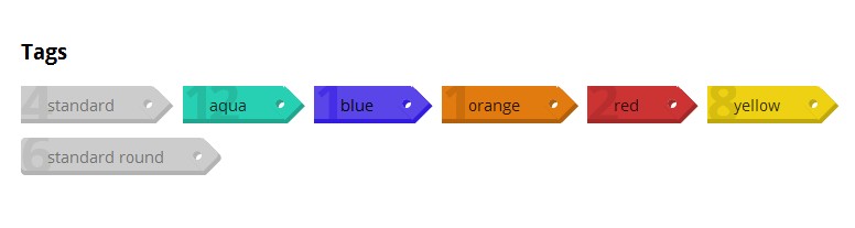
/* Rounded Tag */
.tag-round {
@include border-radius(4px 1px 1px 4px);
&:before {
@include border-radius(1px 1px 4px);
}
}
/* Colors */
.tag-aqua {
@include tag(#28D0B3, darken(#28D0B3, 10%));
}
.tag-blue {
@include tag(#5945E8, darken(#5945E8, 10%), #000);
}
.tag-orange {
@include tag(#E17A0F, darken(#E17A0F, 10%));
}
.tag-red {
@include tag(#CC3333, darken(#CC3333, 10%));
}
.tag-yellow {
@include tag(#EED112, darken(#EED112, 10%));
}