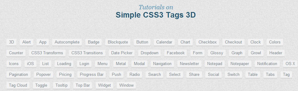
本教程的目的,我们将创建一个3 d盒标签。你很可能需要类似你应该使用这些,例如,一个博客侧边栏。
HTML代码CSS样式
/*
http://www.freshdesignweb.com/beautiful-image-hover-effects-with-jquery-css.html
*/
.freshdesignweb {
width:960px;
height:100%;
margin:0 auto;
position:relative
}
a,a:hover,a:focus {
color:#59b329;
text-decoration:none;
outline:none
}
ul,ol,li {
display:block;
margin:0;
padding:0
}
ol,ul {
list-style:none
}
.tag,.tabs-link {
padding-bottom:3px;
-webkit-box-shadow:inset 0 -2px rgba(255,255,255,0.1),inset 0 -3px rgba(0,0,0,0.1),0 1px rgba(0,0,0,0.05);
box-shadow:inset 0 -2px rgba(255,255,255,0.1),inset 0 -3px rgba(0,0,0,0.1),0 1px rgba(0,0,0,0.05)
}
.tag,.tabs-link {
display:inline-block;
vertical-align:top;
line-height:2em;
padding-top:0;
font-weight:bold;
color:#505050;
text-align:center;
text-shadow:0 1px rgba(255,255,255,0.5);
background:#eaefef;
border:0px white;
border-radius:2px;
-webkit-box-sizing:content-box;
-moz-box-sizing:content-box;
box-sizing:content-box
}
.tag:hover,.tabs-link:hover {
color:white;
background:#20aae5;
text-decoration:none;
text-shadow:0 1px rgba(0,0,0,0.15);
outline:none
}
.tag:active,.tabs-link:active {
padding-bottom:2px;
border-top:1px solid white;
-webkit-box-shadow:inset 0 -2px rgba(0,0,0,0.1),0 1px rgba(0,0,0,0.05);
box-shadow:inset 0 -2px rgba(0,0,0,0.1),0 1px rgba(0,0,0,0.05)
}
.tags-heading {
height:2em;
line-height:2em;
margin-bottom:1em
}
.tags-heading>h4 {
margin:0;
line-height:inherit
}
.tags-toggle {
display:none;
text-align:center;
font-weight:bold
}
.tags-toggle:before {
content:"\e010";
margin-right:.5em
}
.tags-list {
overflow:hidden;
line-height:1.5em
}
.tags-list>li {
float:left;
margin:0 .8em .8em 0
}
.tag {
display:block;
padding-left:.6em;
padding-right:.6em;
line-height:inherit;
font-size:.9375em;
font-weight:normal;
color:#778187;
background:#f2f2f3
}