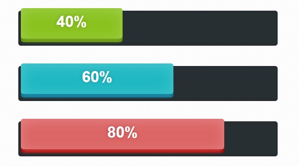
分享一款CSS3 SVG动画进度条应用,进度条在进度加载中将会出现闪闪发光的炫酷特效,遗憾的是,需要高版本的HTML5浏览器才能支持发光动画。

.loading-container {
	width: 600px;
	height: 300px;
	padding: 50px;
	margin: 0px auto;
	border-radius: 10px;
	background: rgba(255,255,255,0.6);
	border: 1px solid #eee;
}

.loading-container .loading-bar {
	margin-bottom: 40px;
}
.loading-bar {
	width: 500px;
	margin: 0px auto;
	height: 61px;
	border-radius: 5px;
	background-color: #282f32;
	padding: 4px 5px;
	box-shadow: inset 3px 0px 10px rgba(0,0,0,0.1);
}

.amount {
	/* we haven't included the colour yet, we'll get to that later. */
	height: 60px;
	border-radius: 5px;
	white-space: nowrap;
	overflow: hidden;
	margin-top: -9px;
}

.lines {
	/* the lines overflow the container. This s a continuous flow of the background */
	width: 200%;
	/* We use a SVG file as the background */
	background: url('lines.svg') repeat-x;
	height: 120%;
	text-align: center;
	margin-top: -35px;
	/* Any overflow is hidden */
	overflow: hidden;
	border-radius: 50px;
	/* Implement the animations, we'll get to that later */
	-webkit-animation: moveBars 1s linear infinite;
	-moz-animation: moveBars 1s linear infinite;
	-ms-animation: moveBars 1s linear infinite;
	-o-animation: moveBars 1s linear infinite;
	animation: moveBars 1s linear infinite;
	font-weight: bold;
	color: #fff;
	color: 1px;
	font-size: 18px;
	text-shadow: 0px 0px 10px rgba(0,0,0,0.3);
}

.loaded {
	text-align: center;
	font-family: Helvetica, sans-serif;
	font-weight: bold;
	position: relative;
	top: 9px;
	font-size: 30px;
	text-shadow: 0px 0px 10px rgba(0,0,0,0.2);
	color: #fff;
	z-index: 9999;
}

.green {
	background-color: #8ac320;
	box-shadow: inset 0px 4px 40px rgba(255,255,255,0.2), 0 10px 10px -5px #79aa1e , 0 7px 0 #628c14;
}

.blue {
	background-color: #20b9c3;
	box-shadow: inset 0px 4px 40px rgba(255,255,255,0.2), 0 10px 10px -5px #1e8aaa, 0 7px 0 #13768c;
}

.red {
	background-color: #dc6565;
	box-shadow: inset 0px 4px 40px rgba(255,255,255,0.2), 0 10px 10px -5px #d23333, 0 7px 0 #8c1212;
}

/* ANIMATIONS */
@keyframes moveBars { 100% { margin-left: -180px; } }
@-webkit-keyframes moveBars { 100% { margin-left: -180px; } }
@-moz-keyframes moveBars { 100% { margin-left: -180px; } }
@-ms-keyframes moveBars { 100% { margin-left: -180px; } }
@-o-keyframes moveBars { 100% { margin-left: -180px; } }

/* ------- IGNORE */

#header {
	width: 100%;
	margin: 0px auto;
}

#header #center {
	text-align: center;
}

#header h1 span {
	color: #000;
	display: block;
	font-size: 50px;
}

#header p {
	font-family: 'Georgia', serif;
}
#header h1 {
	color: #892dbf;
	font: bold 40px 'Bree Serif', serif;
}

#travel {
	padding: 10px;
	background: rgba(0,0,0,0.6);
	border-bottom: 2px solid rgba(0,0,0,0.2);
	font-variant: normal;
	margin-bottom: 40px;
	text-decoration: none;
}

#travel a {
	font-family: 'Georgia', serif;
	text-decoration: none;
	border-bottom: 1px solid #f9f9f9;
	color: #f9f9f9;
}