HTML
<!-- a simple div with some links -->
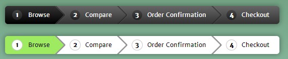
<div class="breadcrumb">
<a href="#" class="active">Browse</a>
<a href="#">Compare</a>
<a href="#">Order Confirmation</a>
<a href="#">Checkout</a>
</div>
<br /><br />
<!-- another version - flat style with animated hover effect -->
<div class="breadcrumb flat">
<a href="#" class="active">Browse</a>
<a href="#">Compare</a>
<a href="#">Order Confirmation</a>
<a href="#">Checkout</a>
</div>
CSS
* {margin: 0; padding: 0;}
html, body {min-height: 100%;}
body {
text-align: center;
padding-top: 100px;
background: #689976;
background: linear-gradient(#689976, #ACDACC);
font-family: 'Merriweather Sans', arial, verdana;
}
.breadcrumb {
/*centering*/
display: inline-block;
box-shadow: 0 0 15px 1px rgba(0, 0, 0, 0.35);
overflow: hidden;
border-radius: 5px;
/*Lets add the numbers for each link using CSS counters. flag is the name of the counter. to be defined using counter-reset in the parent element of the links*/
counter-reset: flag;
}
.breadcrumb a {
text-decoration: none;
outline: none;
display: block;
float: left;
font-size: 12px;
line-height: 36px;
color: white;
/*need more margin on the left of links to accomodate the numbers*/
padding: 0 10px 0 60px;
background: #666;
background: linear-gradient(#666, #333);
position: relative;
}
/*since the first link does not have a triangle before it we can reduce the left padding to make it look consistent with other links*/
.breadcrumb a:first-child {
padding-left: 46px;
border-radius: 5px 0 0 5px; /*to match with the parent's radius*/
}
.breadcrumb a:first-child:before {
left: 14px;
}
.breadcrumb a:last-child {
border-radius: 0 5px 5px 0; /*this was to prevent glitches on hover*/
padding-right: 20px;
}
/*hover/active styles*/
.breadcrumb a.active, .breadcrumb a:hover{
background: #333;
background: linear-gradient(#333, #000);
}
.breadcrumb a.active:after, .breadcrumb a:hover:after {
background: #333;
background: linear-gradient(135deg, #333, #000);
}
/*adding the arrows for the breadcrumbs using rotated pseudo elements*/
.breadcrumb a:after {
content: '';
position: absolute;
top: 0;
right: -18px; /*half of square's length*/
/*same dimension as the line-height of .breadcrumb a */
width: 36px;
height: 36px;
/*as you see the rotated square takes a larger height. which makes it tough to position it properly. So we are going to scale it down so that the diagonals become equal to the line-height of the link. We scale it to 70.7% because if square's:
length = 1; diagonal = (1^2 + 1^2)^0.5 = 1.414 (pythagoras theorem)
if diagonal required = 1; length = 1/1.414 = 0.707*/
transform: scale(0.707) rotate(45deg);
/*we need to prevent the arrows from getting buried under the next link*/
z-index: 1;
/*background same as links but the gradient will be rotated to compensate with the transform applied*/
background: #666;
background: linear-gradient(135deg, #666, #333);
/*stylish arrow design using box shadow*/
box-shadow:
2px -2px 0 2px rgba(0, 0, 0, 0.4),
3px -3px 0 2px rgba(255, 255, 255, 0.1);
/*
5px - for rounded arrows and
50px - to prevent hover glitches on the border d using shadows*/
border-radius: 0 5px 0 50px;
}
/*we dont need an arrow after the last link*/
.breadcrumb a:last-child:after {
content: none;
}
/*we will use the :before element to show numbers*/
.breadcrumb a:before {
content: counter(flag);
counter-increment: flag;
/*some styles now*/
border-radius: 100%;
width: 20px;
height: 20px;
line-height: 20px;
margin: 8px 0;
position: absolute;
top: 0;
left: 30px;
background: #444;
background: linear-gradient(#444, #222);
font-weight: bold;
}
.flat a, .flat a:after {
background: white;
color: black;
transition: all 0.5s;
}
.flat a:before {
background: white;
box-shadow: 0 0 0 1px #ccc;
}
.flat a:hover, .flat a.active,
.flat a:hover:after, .flat a.active:after{
background: #9EEB62;
}