Pinterest Grid是一款仿Pinterest网站的响应式网格瀑布流布局jQuery插件。该瀑布流插件使用简单,可以随父容器的大小自动调节网格布局,并且支持IE8+的IE浏览器。
使用方法
使用该瀑布流插件需要引入jQuery和pinterest_grid.js文件。
<script src="js/jquery.min.js"></script>
<script src="js/pinterest_grid.js"></script>
HTML结构
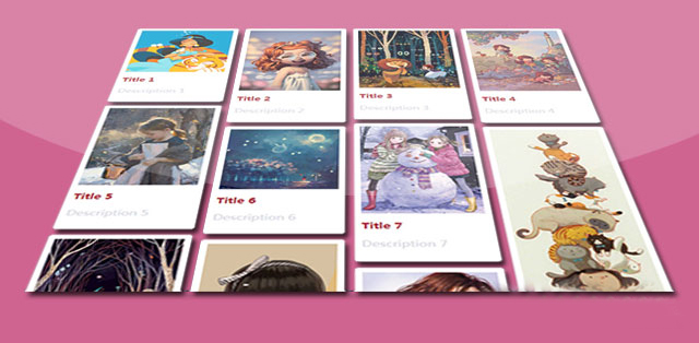
该jQuery瀑布流布局插件使用下面的HTML结构。
<section id="demo">
<article class="white-panel">
<img src="1.jpg" alt="...">
<h1><a href="#">Title 1</a></h1>
<p>Description 1</p>
</article>
<article class="white-panel">
<img src="2.jpg" alt="...">
<h1><a href="#">Title 2</a></h1>
<p>Description 2</p>
</article>
<article class="white-panel">
<img src="3.jpg" alt="...">
<h1><a href="#">Title 3</a></h1>
<p>Description 3</p>
</article>
...
</section>
CSS样式
你需要为该瀑布流布局添加下面的一些必要的CSS样式。
#gallery-wrapper {
position: relative;
max-width: 100%;
width: 100%;
}
img.thumb {
width: 100%;
max-width: 100%;
height: auto;
}
.white-panel {
position: absolute;
background: white;
border-radius: 5px;
box-shadow: 0px 1px 2px rgba(0,0,0,0.3);
padding: 10px;
}
.white-panel h1 {
font-size: 1em;
}
.white-panel h1 a {
color: #A92733;
}
.white-panel:hover {
box-shadow: 1px 1px 10px rgba(0,0,0,0.5);
margin-top: -5px;
-webkit-transition: all 0.3s ease-in-out;
-moz-transition: all 0.3s ease-in-out;
-o-transition: all 0.3s ease-in-out;
transition: all 0.3s ease-in-out;
}
初始化插件
在页面DOM元素加载完毕之后,可以通过pinterest_grid()方法来初始化该瀑布流布局插件。
$("#gallery-wrapper").pinterest_grid();
配置参数
该瀑布流布局插件有以下一些可用的配置参数。
no_columns:网格布局一行的列数。默认值为一行3个网格。
padding_x:网格在X轴方向的padding值。默认值为10像素。
padding_y:网格在Y轴方向的padding值。默认值为10像素。
margin_bottom:网格底部的margin值。默认值为50像素。
single_column_breakpoint:指定在视口多大时一行只显示一个网格。