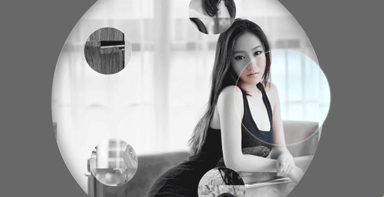
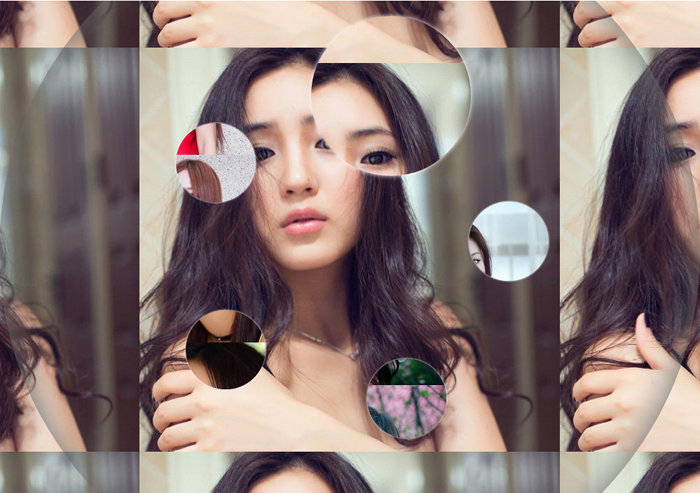
鼠标移至每一个小的圆圈内会自动显示一张完整的清晰图片,创意十足!很有美感!.
相关Css代码
  .gallery:before, .gallery__item:last-child
        {
            position: fixed;
            top: 50%;
            left: 50%;
            margin: -31.25em;
            width: 62.5em;
            height: 62.5em;
        }
        .gallery:before
        {
            z-index: -1;
            border-radius: 50%;
            content: '';
            box-shadow: inset 0 0 5em dimgrey, 0 0 0 50vw dimgrey;
        }
        .gallery__item
        {
            background-blend-mode: luminosity;
            transition: -webkit-transform 0.5s cubic-bezier(0.175, 0.885, 0.32, 1.275), background-image 0.5s;
        }
        .gallery__item:not(:last-child)
        {
            position: absolute;
            top: 50%;
            left: 50%;
            width: 32vmin;
            height: 32vmin;
            border-radius: 50%;
            box-shadow: 0 0 .5em white;
        }
        .gallery__item:nth-child(1)
        {
            margin: 13.87457vmin -4.53223vmin;
            -webkit-transform: scale(0.5);
            background: url("imgs/1.jpg") 50% 50% fixed whitesmoke;
        }
        .gallery__item:nth-child(1):hover
        {
            -webkit-transform: scale(1);
            background-blend-mode: normal;
            cursor: pointer;
        }
        .gallery__item:nth-child(1):hover ~ :last-child
        {
            background: url("imgs/1.jpg") 50% 50% fixed dimgray;
        }
        .gallery__item:nth-child(1):hover ~ :last-child:after
        {
            opacity: .001;
        }
        .gallery__item:nth-child(2)
        {
            margin: 4.13825vmin -40.86867vmin;
            -webkit-transform: scale(0.5);
            background: url("imgs/2.jpg") 50% 50% fixed whitesmoke;
        }
        .gallery__item:nth-child(2):hover
        {
            -webkit-transform: scale(1);
            background-blend-mode: normal;
            cursor: pointer;
        }
        .gallery__item:nth-child(2):hover ~ :last-child
        {
            background: url("imgs/2.jpg") 50% 50% fixed dimgray;
        }
        .gallery__item:nth-child(2):hover ~ :last-child:after
        {
            opacity: .001;
        }
        .gallery__item:nth-child(3)
        {
            margin: -33.42845vmin -42.83746vmin;
            -webkit-transform: scale(0.5);
            background: url("imgs/3.jpg") 50% 50% fixed whitesmoke;
        }
        .gallery__item:nth-child(3):hover
        {
            -webkit-transform: scale(1);
            background-blend-mode: normal;
            cursor: pointer;
        }
        .gallery__item:nth-child(3):hover ~ :last-child
        {
            background: url("imgs/3.jpg") 50% 50% fixed dimgray;
        }
        .gallery__item:nth-child(3):hover ~ :last-child:after
        {
            opacity: .001;
        }
        .gallery__item:nth-child(4)
        {
            margin: -46.90963vmin -7.71779vmin;
            -webkit-transform: scale(0.5);
            background: url("imgs/4.jpg") 50% 50% fixed whitesmoke;
        }
        .gallery__item:nth-child(4):hover
        {
            -webkit-transform: scale(1);
            background-blend-mode: normal;
            cursor: pointer;
        }
        .gallery__item:nth-child(4):hover ~ :last-child
        {
            background: url("imgs/4.jpg") 50% 50% fixed dimgray;
        }
        .gallery__item:nth-child(4):hover ~ :last-child:after
        {
            opacity: .001;
        }
        .gallery__item:nth-child(5)
        {
            margin: -17.67475vmin 15.95615vmin;
            -webkit-transform: scale(0.5);
            background: url("imgs/5.jpg") 50% 50% fixed whitesmoke;
        }
        .gallery__item:nth-child(5):hover
        {
            -webkit-transform: scale(1);
            background-blend-mode: normal;
            cursor: pointer;
        }
        .gallery__item:nth-child(5):hover ~ :last-child
        {
            background: url("imgs/5.jpg") 50% 50% fixed dimgray;
        }
        .gallery__item:nth-child(5):hover ~ :last-child:after
        {
            opacity: .001;
        }
        .gallery__item:last-child
        {
            z-index: -2;
        }
        .gallery__item:last-child:after
        {
            position: absolute;
            top: 0;
            right: 0;
            bottom: 0;
            left: 0;
            opacity: .999;
            background: dimgrey;
            transition: opacity 2s;
            content: '';
        }