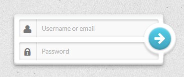
HTML
CSS
.form-1 {
    /* Size & position */
    width: 300px;
    margin: 60px auto 30px;
    padding: 10px;
    position: relative; /* For the submit button positioning */

    /* Styles */
    box-shadow:
        0 0 1px rgba(0, 0, 0, 0.3),
        0 3px 7px rgba(0, 0, 0, 0.3),
        inset 0 1px rgba(255,255,255,1),
        inset 0 -3px 2px rgba(0,0,0,0.25);
    border-radius: 5px;
    background: linear-gradient(#eeefef, #ffffff 10%);
}

.form-1 .field {
    position: relative; /* For the icon positioning */
}
重要的是:我们把它定位相对绝对为了把提交按钮。我们做同样的事情 .field容器将绝对的图标。
说到图标,现在让我们处理它。
.form-1 .field i {
    /* Size and position */
    left: 0px;
    top: 0px;
    position: absolute;
    height: 36px;
    width: 36px;

    /* Line */
    border-right: 1px solid rgba(0, 0, 0, 0.1);
    box-shadow: 1px 0 0 rgba(255, 255, 255, 0.7);

    /* Styles */
    color: #777777;
    text-align: center;
    line-height: 42px;
    transition: all 0.3s ease-out;
    pointer-events: none;
}
我们添加一个微妙的行右边的图标设置一个正确的边界和阴影效果。
因为我们要去改变颜色 :hover和 :focus,给他们一个平稳过渡。
添加“pointer-events:没有”将允许实际点击的图标,并输入焦点区域的谎言下(我们实际上是点击输入)。
现在我们需要给一些样式:
.form-1 input[type=text],
.form-1 input[type=password] {
    font-family: 'Lato', Calibri, Arial, sans-serif;
    font-size: 13px;
    font-weight: 400;
    text-shadow: 0 1px 0 rgba(255,255,255,0.8);

    /* Size and position */
    width: 100%;
    padding: 10px 18px 10px 45px;

    /* Styles */
    border: none; /* Remove the default border */
    box-shadow:
        inset 0 0 5px rgba(0,0,0,0.1),
        inset 0 3px 2px rgba(0,0,0,0.1);
    border-radius: 3px;
    background: #f9f9f9;
    color: #777;
    transition: color 0.3s ease-out;
}

.form-1 input[type=text] {
    margin-bottom: 10px;
}
我们确保图标和重叠的输入按钮文本通过输入一个像样的填充。设定一个底部边距第一个输入,以防止第二个崩溃。
在进一步讨论之前,让我们不要忘记设置一些风格的、盘旋和专注的状态。
.form-1 input[type=text]:hover ~ i,
.form-1 input[type=password]:hover ~ i {
    color: #52cfeb;
}

.form-1 input[type=text]:focus ~ i,
.form-1 input[type=password]:focus ~ i {
    color: #42A2BC;
}

.form-1 input[type=text]:focus,
.form-1 input[type=password]:focus,
.form-1 button[type=submit]:focus {
    outline: none;
}
两件事情:我们使用兄弟选择器(~)改变与输入交互时图标的颜色:浅蓝色盘旋,深蓝色的焦点。我们去除铬的轮廓。
我们必须风格的最后一件事就是submit按钮。对于一些丑陋的重叠的原因(是什么可怕的产权z - index),我不得不将它放到一个容器里,去做事。我们可以删除这个容器,但它需要一些CSS技巧,这不是重点。
.form-1 .submit {
    /* Size and position */
    width: 65px;
    height: 65px;
    position: absolute;
    top: 17px;
    right: -25px;
    padding: 10px;
    z-index: 2;

    /* Styles */
    background: #ffffff;
    border-radius: 50%;
    box-shadow:
        0 0 2px rgba(0,0,0,0.1),
        0 3px 2px rgba(0,0,0,0.1),
        inset 0 -3px 2px rgba(0,0,0,0.2);
}
事情相当简单:我们创建一个圆形元素并把它放在我们的形式,稍微的右边。盒阴影突出这种重叠效应。
问题:框阴影突出这种重叠效应,但他们也可以摧毁它。事实上,我们可以看到影子的框架形式之间的间距(表单的字段和正确的填充)。
基本上,我们可以用某种面具隐藏那些阴影的背景颜色相同的形式。这是一个伪元素的工作!
.form-1 .submit:after {
    /* Size and position */
    content: "";
    width: 10px;
    height: 10px;
    position: absolute;
    top: -2px;
    left: 30px;

    /* Styles */
    background: #ffffff;

    /* Other masks trick */
    box-shadow: 0 62px white, -32px 31px white;
}
有三个阴影覆盖因为我们的圆形元素之间的间距在十字路口右填充的字段和表单。
我们第一个顶部的圆形元素。和css属性,我们可以假的另外两个面具。我认为,这是很难解释的东西,所以我建议你打开你的开发工具和禁用不必行 .submit:after看到发生了什么。
最后但并非最不重要,我们的实际提交按钮:
.form-1 button {
    /* Size and position */
    width: 100%;
    height: 100%;
    margin-top: -1px;

    /* Icon styles */
    font-size: 1.4em;
    line-height: 1.75;
    color: white;

    /* Styles */
    border: none; /* Remove the default border */
    border-radius: inherit;
    background: linear-gradient(#52cfeb, #42A2BC);
    box-shadow:
        inset 0 1px 0 rgba(255,255,255,0.3),
        0 1px 2px rgba(0,0,0,0.35),
        inset 0 3px 2px rgba(255,255,255,0.2),
        inset 0 -3px 2px rgba(0,0,0,0.1);

    cursor: pointer;
}
最后,盘旋的风格,集中(如当跨栏)和活动(压)状态的按钮:
.form-1 button:hover,
.form-1 button[type=submit]:focus {
    background: #52cfeb;
    transition: all 0.3s ease-out;
}

.form-1 button:active {
    background: #42A2BC;
    box-shadow:
        inset 0 0 5px rgba(0,0,0,0.3),
        inset 0 3px 4px rgba(0,0,0,0.3);
}