CSS
首先,演示的方式包装,容器将包含整个演示。我们将定义总体风格,一定要设置一个 perspective激活3 d空间,否则,整个演示将平面和两个维度。
.demo-wrapper {
padding: 2em .5em;
width: 100%;
height:100%;
perspective: 3300px;
position: relative;
}
现在让我们开始与仪表板样式和动画。
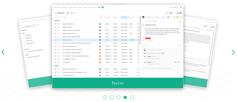
第一个动画应用到仪表板页面加载时触发。仪表板最初隐藏和翻译右边的屏幕,褪色和翻译在页面加载位置
.dashboard {
margin: 0 auto;
width: 100%;
padding: 1em;
transform: translateX(200px);
opacity:0;
animation: start 1s ease-out forwards;
}
@keyframes start{
0%{
transform: translateX(200px);
opacity:0;
}
50%{
opacity:1;
}
100%{
transform: translateX(0);
opacity:1;
}
}
仪表板也逐渐进入瓷砖时点击视图和褪色。一旦点击一个瓷砖,仪表板将沿z轴,减少在大小,及其透明度逐渐消退,直到它变成0。一打开页面关闭时,仪表板消失回视图。
仪表板褪色的三列在一个接一个,略有延迟。当一个页面被关闭,一个类名添加到每一列(通过Javascript),和每一个类调用动画有一定延迟。
这里的类和动画应用到仪表板上单击瓷砖和关闭页面:
.fadeOutback{
animation: fadeOutBack 0.3s ease-out 1 normal forwards;
}
.fadeInForward-1, .fadeInForward-2, .fadeInForward-3 {
/*remember: in the second animation u have to set the final values reached by the first one*/
opacity:0;
transform: translateZ(-5em) scale(0.75);
animation: fadeInForward .5s cubic-bezier(.03,.93,.43,.77) .4s normal forwards;
}
.fadeInForward-2{
animation-delay: .55s;
}
.fadeInForward-3{
animation-delay: .7s;
}
@keyframes fadeOutBack{
0% {transform: translateX(-2em) scale(1); opacity:1;}
70% {transform: translateZ(-5em) scale(0.6); opacity:0.5;}
95% {transform: translateZ(-5em) scale(0.6); opacity:0.5;}
100% {transform: translateZ(-5em) scale(0); opacity:0;}
}
@keyframes fadeInForward{
0% {transform: translateZ(-5em) scale(0); opacity:0;}
100% {transform: translateZ(0) scale(1); opacity:1;}
}
我们现在要的页面风格。
.r-page {
width: 100%;
height: 100%;
text-align: center;
font-size: 2em;
font-weight: 300;
position: absolute;
right: 0;
top: 0;
left:0;
bottom:0;
opacity: 0;
color: white;
z-index: 10;
padding:10px;
transform-origin: 100% 0%;
transform: rotateY(-90deg) translateZ(5em)
}
.s-page {
color: white;
z-index: 10;
text-align: center;
font-size: 2em;
font-weight: 300;
}
.page-content{
overflow-y:auto;
max-height:100%;
font-size:.6em;
padding:.6em;
text-align:left;
}
.s-page, .r-page{
background-color: white;
color:black;
}
.page-title {
margin: .25em 0;
font-weight: 100;
font-size: 3em;
text-align:center;
}
.close-button {
font-size: 1.5em;
width: 1em;
height: 1em;
position: absolute;
top: .75em;
right: .75em;
cursor: pointer;
line-height: .8em;
text-align: center
}
我设置的初始位置 r-page在3 d空间首先旋转的y轴(垂直轴),然后我搬到第5页em的左边屏幕使用 translateZ。永远记住:当你把一个元素在3 d,你改变它的坐标系统。我想做的是第5页em移到左边的屏幕,而是使用 translateX我使用 translateZ,因为在第一次转型(y轴)坐标系统也旋转,所以现在z轴指向左边,x轴是指向你,观众。
所有的页面,除了s-page应用页面,有相同的初始位置在三维空间。的 s-page年代,另一方面,定位-150%离开屏幕的画布,这样他们当他们滑入视图动画是解雇。
一旦点击每个页面的瓷砖,添加相应的类(通过javascript)将打开页面,每个类和要求一定的动画。所以,每个页面将得到一个类名,定义页面的3 d效果。
这些类名触发页面的打开和关闭,随着动画定义为每一个类。
/* opens the r-page type pages*/
.openpage{
animation: rotatePageInFromRight 1s cubic-bezier(.66,.04,.36,1.03) 1 normal forwards;
}
/* closes the r-page type pages */
.slidePageLeft{
transform: rotateY(0) translateZ(0) ; opacity:1;
animation:slidePageLeft .8s ease-out 1 normal forwards;
}
/* opens the s-page type pages */
.slidePageInFromLeft{
animation: slidePageInFromLeft .8s cubic-bezier(.01,1,.22,.99) 1 0.25s normal forwards;
}
/* closes the s-page type pages*/
.slidePageBackLeft{
opacity:1;
left:0;
animation: slidePageBackLeft .8s ease-out 1 normal forwards;
}
我用的是 animation简写属性在这里。最后一个值 forwards对应于 animation-fill-mode属性,该属性必须设置 forwards页面,否则将回到其最初的动画结束后“关闭”位置。为了保持页面打开,并且能够创建顺序动画,元素必须在最终状态定义的第一个动画,和从那里开始第二个动画。
这些动画应用于页面的类:
@keyframes rotatePageInFromRight{
0% {transform:rotateY(-90deg) translateZ(5em);opacity:0}
30% {opacity:1}
100% {transform: rotateY(0deg) translateZ(0) ; opacity:1}
}
/*When the close-button is clicked, the page slides to the left*/
/*note that the start of the second animation is the same state as the
end of the previous one*/
@keyframes slidePageLeft{
0% {left:0; transform: rotateY(0deg) translateZ(0) ; opacity:1}
70% {opacity:1;}
100% {opacity:0; left:-150%; transform: rotateY(0deg)}
}
@keyframes slidePageInFromLeft{
0% {opacity:0; }
30% {opacity:1}
100% {opacity:1; left:0;}
}
@keyframes slidePageBackLeft{
0% {opacity:1; left:0; transform: scale(0.95);}
10% {transform: scale(0.9);}
70% {opacity:1;}
100% {opacity:0; left:-150%;}
}
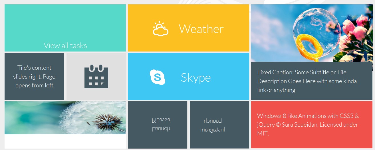
最后但并非最不重要的是我们将风格仪表板瓷砖和定义转换和动画应用于当他们徘徊。
总体风格定义瓷砖的大小:
.tile{
float: left;
margin: 0 auto 1%;
color: white;
font-size: 1.3em;
text-align: center;
height: 8em;
font-weight: 300;
overflow: hidden;
cursor: pointer;
position:relative;
background-color: #fff;
color: #333;
position:relative;
transition: background-color 0.2s ease-out
}
.tile-2xbig{
height:16.15em;
width:100%;
}
.tile-big {
width: 100%
}
.tile-small {
width: 49%;
margin-right: 2%
}
.tile-small.last {
margin-right: 0
}
几块包含一个图像以及图像标题。这些瓷砖将得到一个类 fig-tile确定类型的Javascript代码。用于文本和背景的颜色相应的页面将会从标题的颜色检索,所以不要忘了定义它们。标题可以是固定的,也可以当瓷砖徘徊下滑:
.tile-caption{
position:absolute;
z-index:1;
background-color: #455962;
color:#fff;
font-size:1em;
padding:1em;
text-align: left;
}
.caption-bottom{
left:0;
bottom:0;
right:0;
height:40%;
}
.caption-left{
left:-100%;
top:0;
bottom:0;
width:40%;
transition: left .3s linear;
}
.tile:hover .caption-left{
left:0;
}
普通瓷砖,没有特殊的动画,将改变他们的背景和文本颜色在盘旋。为了确保文本垂直集中在每瓦,每一个将包含一个 div包含文本的段落。我们将使用table-cell垂直显示房地产中心这个文本。
.tile div{
position:absolute;
top:0; left:0; right:0; bottom:0;
width:100%;
height:100%;
text-align:center;
display:table;
padding:0 1em;
transition: all .3s ease;
}
.tile div p{
display:table-cell;
vertical-align:middle;
}
我将跳过的一般风格的瓷砖为了简洁起见,但确保你设置背景颜色和文本颜色瓷砖,甚至那些将会由一个图像,因为这些颜色会检索通过Javascript和设置为相应的页面的颜色的瓷砖。让我们继续看动画和过渡在瓷砖上。
瓷砖的文本幻灯片上盘旋,我们应用一个类 slideTextUp.
/* slide text inside tile up */
/* 2nd div will be positioned below the bottom of the tile*/
.slideTextUp div:nth-child(2){
top:100%;
}
/*both divs will be translated up on hover*/
.slideTextUp:hover div{
transform: translateY(-100%);
}
.tile-1 p{
font-size:1.3em;
}
同样,瓷砖与文本左右滑动,将类名 slideTextLeft和 slideTextRight,类似的结构上面的瓷砖。
/* slide text inside tile to the right*/
.slideTextRight div:first-child{
left:-100%;
}
.slideTextRight:hover div{
transform: translateX(100%);
}
/* slide text inside tile to the left */
.slideTextLeft div:nth-child(2){
left:100%;
}
.slideTextLeft:hover div{
transform: translateX(-100%);
}
两个瓷砖有不同的悬浮效果,他们旋转揭示瓷砖的背面。这种影响是一个非常简单和基本的“卡片翻转”效应。我不会进入这种效果的细节,但是如果你是新手,你可以阅读更多关于它这个优秀的教程由大卫·桑德罗。
对于这种翻转效应,应用 rotate3d类瓷砖你想翻转。与垂直翻转卡我们将添加一个类 rotate3dY,水平翻转我们将应用一个类 rotate3dX(除了 rotate3d类),我们将使用以下方式:
/* rotate tile in 3D*/
.rotate3d{
/* add a perspective to the tile to activate 3d space inside it*/
perspective: 800px;
overflow: visible;
}
.faces{
/* preserve the 3d space in the container wrapping the two "faces" and define a transition */
transform-style: preserve-3d;
transition: transform 1s;
}
.faces div {
/* position faces on top of each other */
display: block;
position: absolute;
top:0; left:0; right:0; bottom:0;
width: 100%;
height: 100%;
/* hide backface visibility so that the back of the face is hidden when it's rotated */
backface-visibility: hidden;
}
我们将会旋转的瓷砖,这样两个面孔。
.rotate3dY .back{
transform: rotateY( 180deg );
}
.rotate3dX .back{
transform: rotateX( 180deg );
}
当瓷砖徘徊, .faces div将旋转,露出后面的脸。
.rotate3dY:hover .faces:hover{
transform: rotateY( 180deg );
}
.rotate3dX:hover .faces:hover{
transform: rotateX( 180deg );
}
在3 d风格旋转,记住设置的背景和文本颜色 .front脸,所以这些颜色检索和设置为瓷砖的页面时打开。
这是所有的风格和动画!
现在,让我们定义仪表板的响应方式。仪表板列最初宽屏在小屏幕上(记得我们开始移动先行”),他们将彼此旁边漂浮在大屏幕上。
.col1,
.col2,
.col3 {
width: 99%;
margin: 1em auto
}
@media screen and (min-width: 43.75em) {
.col1,
.col2,
.col3 {
float: left;
margin-right: 1%;
width: 49%
}
.page-title{
font-size:2.5em;
}
.page-content{
font-size:1em;
}
.close-button{
font-size:2em;
}
}
@media screen and (min-width: 64em) {
.col1,
.col2,
.col3 {
float: left;
margin-right: .5%;
width: 31%
}
.col3 {
margin-right: 0
}
.col1 {
margin-left: 2em
}
.page-title{
font-size:3.5em;
}
}
JavaScript
所有的点击事件处理wtih Javascript。我将为这个示例使用jQuery。事件处理程序将被设置在每个的仪表板的瓷砖,当检测到一个单击事件,我们将获取的相应页面的名称和类型 data-page-type和 data-page-name属性,并使用这些打开页面。
其他点击事件处理时,在每个页面点击关闭按钮。每个页面的关闭按钮类型将合适的类名关闭这个页面类型。
此外,为了给每个页面相同的背景颜色和文本颜色对应的瓷砖,我们将首先遍历瓷砖,检索它的颜色,然后它适用于其corresponsing页面。如果瓷砖有 rotate3d类,它看起来的background-color面前瓷砖的“面子”,并应用到页面。
(function(){
//get the background-color for each tile and apply it as background color for the cooresponding screen
$('.tile').each(function(){
var $this= $(this),
page = $this.data('page-name'),
bgcolor = $this.css('background-color'),
textColor = $this.css('color');
//if the tile rotates, we'll use the colors of the front face
if($this.hasClass('rotate3d')) {
frontface = $this.find('.front');
bgcolor = frontface.css('background-color');
textColor = frontface.css('color');
}
//if the tile has an image and a caption, we'll use the caption styles
if($this.hasClass('fig-tile')) {
caption = $this.find('figcaption');
bgcolor = caption.css('background-color');
textColor = caption.css('color');
}
$this.on('click',function(){
$('.'+page).css({'background-color': bgcolor, 'color': textColor})
.find('.close-button').css({'background-color': textColor, 'color': bgcolor});
});
});
function showDashBoard(){
for(var i = 1; i <= 3; i++) {
$('.col'+i).each(function(){
$(this).addClass('fadeInForward-'+i).removeClass('fadeOutback');
});
}
}
function fadeDashBoard(){
for(var i = 1; i <= 3; i++) {
$('.col'+i).addClass('fadeOutback').removeClass('fadeInForward-'+i);
}
}
//listen for when a tile is clicked
//retrieve the type of page it opens from its data attribute
//based on the type of page, add corresponding class to page and fade the dashboard
$('.tile').each(function(){
var $this= $(this),
pageType = $this.data('page-type'),
page = $this.data('page-name');
$this.on('click',function(){
if(pageType === "s-page"){
fadeDashBoard();
$('.'+page).addClass('slidePageInFromLeft').removeClass('slidePageBackLeft');
}
else{
$('.'+page).addClass('openpage');
fadeDashBoard();
}
});
});
//when a close button is clicked:
//close the page
//wait till the page is closed and fade dashboard back in
$('.r-close-button').click(function(){
$(this).parent().addClass('slidePageLeft')
.one('webkitAnimationEnd oanimationend msAnimationEnd animationend', function(e) {
$(this).removeClass('slidePageLeft').removeClass('openpage');
});
showDashBoard();
});
$('.s-close-button').click(function(){
$(this).parent().removeClass('slidePageInFromLeft').addClass('slidePageBackLeft');
showDashBoard();
});
})();
希望你喜欢这个教程,发现它有用