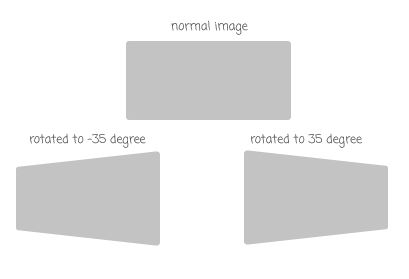
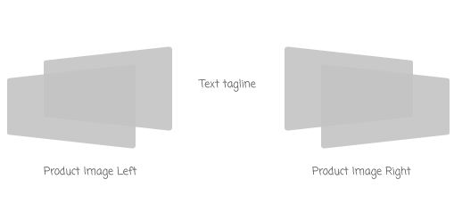

动画 每个产品形象会跳跃动画与无限循环。使它更有吸引力我们为每秒钟图像添加延迟左和右。我们将创建一个关键帧 bouncing-left和 bouncing-right并将它们添加在产品形象和定位。.left img:nth-child(1) { left: 4em; top: 8em; animation: bouncing-left 2s ease-in-out infinite alternate both; } .left img:nth-child(2) { left: -2em; top: 12em; animation: bouncing-left 2s ease-in-out infinite alternate both; animation-delay: .5s; } .rightright img:nth-child(1) { rightright: 4em; top: 8em; animation: bouncing-rightright 2s ease-in-out infinite alternate both; } .rightright img:nth-child(2) { rightright: -2em; top: 12em; animation: bouncing-rightright 2s ease-in-out infinite alternate both; animation-delay: .5s; } @keyframes bouncing-left { 0% { transform: translateY(-10px) rotate3d(0,1,0,-35deg); } 100% { transform: translateY(10px) rotate3d(0,1,0,-35deg); } } @keyframes bouncing-rightright { 0% { transform: translateY(-10px) rotate3d(0,1,0,35deg); } 100% { transform: translateY(10px) rotate3d(0,1,0,35deg); } }我们还添加旋转的动画 wrapper-item旋转,旋转将开始从0度到35度然后旋转-35度,回到0度。这个动画只会移动3次,延迟3秒开始。.wrapper-item { position: relative; margin: 0 auto; width: 1000px; height: 400px; margin-bottom: 3em; transform-style: preserve-3d; transition: .5s ease-in-out; animation: rotating 10s ease-in-out 3 alternate both; animation-delay: 3s; } @keyframes rotating { 0% { transform: rotate3d(0,1,0,0deg); } 30% { transform: rotate3d(0,1,0,35deg); } 60% { transform: rotate3d(0,1,0,-35deg); } 100% { transform: rotate3d(0,1,0,0deg); } }JS$(document).ready(function() { //Show only first wrapper $( '.wrapper-item:not(:first-child)' ).hide(); //Navigation on click $( '.nav' ).on( 'click' , function() { this_index = parseInt($(this).index()) + 1; $( '.nav' ).removeClass( 'selected' ).end().find( this ).addClass( 'selected' ); $( '.wrapper-item' ).hide(); $( '.wrapper-item:nth-child(' + this_index + ')' ).fadeIn( 'fast' ); } ); });